Aurora energy consumer app design
Client
Aurora Energy Tasmania, utilities
My role focus
Service Design (40%), User Research (40%), Workshop Facilitation (20%) as a consultant
My regular collaborators
UI designer, Product Owner, Tech delivery team
Other Stakeholders
Marketing, Operations, teams from business.
Delivered
Service Blueprint including user journey, staff processes and user experience design of a first-time award winning application
Workshops, journey mapping, user research insights. Then create features and work with UI designer to help define experience.

Background
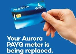
Since the 1990s, Aurora PAYG energy customers were using a physical card that sometimes had to be topped up during odd hours from the service station so that they could keep the heater on. This was not 24/7 and Tasmania has harsh winters.
Aurora Energy with about 240K customers set out to develop a customer-centred mobile-first app experience for their customers to replace this card to go with smart meters
A high level of coaching and education was required for Aurora as they were new to Agile and product development with human centred design methods
Aurora energy is rolling out modern electricity meters that work with 4G
Customers will need be provided with a self-service app to pre-pay and manage their power accounts
Focussing question
How can we help pre-paid electricity users check, manage, and pay for their energy online to prevent them from running out of credit and being without power?
POINTS TO NOTE:
Aurora Energy in Tasmania was rolling our Advanced meters that measure electricity using 4G networks. The product that we were going to build, was a user interface to support the Advanced meters to give them visibility of their electricity and help them pre-pay for it.
A trial prior to this project indicated significant appetite from the consumers of pre-paid electricity, thus validating the value proposition.
An advanced meter is the next generation of electricity meter. It measures how much electricity is used in 15-minute intervals. Where mobile phone coverage allows, this information will be sent securely on a daily basis (once per day), to Aurora Energy.
The solution
A realtime mobile application that syncs with
with pre-paid 4G electricity meters
Approach
Immersion
Going through existing research such as from trial done by Aurora and customer feedback, speak to subject matter experts in the business
Journey mapping
Running As-Is and To-Be customer workshops to define customer journey front end and back-ground processes and alleviate pain points
Define and design
Designing user flows for the interface with product manager, UI designer and dev team ensuring feasibility of key features
Prototype and test
Prototyping a set of key feature flows for the MVP.
User-testing with end users and community advocacy representatives
Refine and deliver
Iterating on UI design with insights from testing
Working out roll-out with Marketing, technology and support from Aurora
Workshop facilitation
I designed and led many workshops for this project to align everyone and speed up decision-making in its fast-paced environment. This included subject matter experts from Aurora energy from product, tech, billing, marketing and support and developers and architects from RXP as the technology vendor
As-Is experience
Ran workshops with key stakeholders to find current state journey map and pain points.
➜
➜
➜
To-Be experience
Followed by customer journey mapping to create the proposed service blueprint and with the product owner to design features and wireframes
Insights across journey
Placing the insights across the user journey ensured a holistic view of downstream and upstream impacts of changes to processes and technology
Process design requirements
Example: To allow customers to sign-up easily, existing process need to be changed from call-center team to enable eligible customers to register
Insights against UX flows and customer journey
Usability testing
I planned and conducted end user research activities with Tasmanians to validate and develop the MVP further, in the form of prototype and feature testing.
With insights from user testing and journey mapping I ran smaller workshops internally to determine service design requirements from Marketing and Support
Servicing and support
Customer journey map and Service Blueprint
Low fidelity prototyping
This process developed the content strategy and structure for the mobile app. Stakeholders, experts, and team members shared their ideas and concerns, contributing to the overall experience. As I facilitated these screen development workshops, the UI designer would convert them to low-fidelity digital screens and prototypes
Prototyping and testing
I planned and conducted end user research activities with Tasmanians to validate and develop the MVP further, in the form of prototype and feature testing. Since there was already a trial done with 50 users, we built upon the learnings from that for attitudes and some behaviours.
Participant mix
8
end users (residents using prepaid electricity) incl. low literacy users
1:1 Moderated usability testing with tasks and scenarios - prototype with interactions, copy, features
4
Key Insights
Severity matrix for noted issues to indicate business impact, to prioritise issues
+
+
from
2
Community advocacy group representatives
Concept testing for other loosely developed features options
28
Unique findings and recommendations
+
+
and
50
Previous trial users (learnings from trial)
Mixed methods:
Desktop research and competitor analysis
Synthesised data for four themes: Balance, Usage, Payments, Menu/Other
5
Guiding design principles
Communicated the insights and prioritised as follows:
Placed insights along the Service Blueprint and user journey to design interventions
Partnered with Product team to prioritise solving for high impact and high risk issues for MVP
Worked with tech team to find best ways to make the solutions feasible in the given timeframe for launch
Research insights
Simplifying setup for budgeting and transparency
Recommended actions
Campaigns prior to launch to address simplicity of Tariff 93 and APAYG+
Graphic to denote time of use to be given with welcome pack
Plain language and explaining regulatory jargon
Be proactive
Make it easy
Learning to use interface to manage usage
Recommended actions
Offer in-app help and guidance without directing users to the website.
Assist users in finishing tasks to reduce drop-offs with in-context help
Include a tour and an in-app link to navigate the app effectively.
Make it easy
Empower me
Helping one another to manage electricity
Recommended actions
Users should see authorised properties through strict validation, enabling management of payments and notifications.
Educating skeptical or non-tech savvy people that they can still use other avenues to manage payments
Use of advocacy reps
Think locally
Empower me
Designing simplicity for a large percentage of functionally illiterate population in the state, access to smartphone not being a barrier, Use of copy, language and calls to action, ability for users to help others in the community, encouraging behaviour change, future proofing for different customers like business users were some of the other considerations.
Insights add value and cause behaviour change
Recommended actions
Visualising power usage and sending notifications in order to encourage users to consume electricity at off peak where possible
Personalised insights that are clear and help users change habits to prevent bill shock and high usage.
Empower me
think locally
Offer solutions
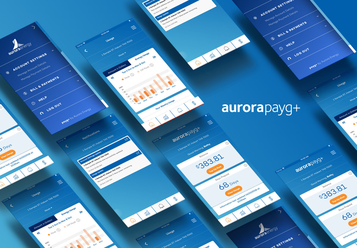
User Interface
These images are sourced from Aurora Energy website. I worked with a UI designer to help shape the wireframes and user actions from workshops and conversations and user testing outcomes
Features and benefits
Clean interface with differentiation using form and colour
Granularity of data available to plan ahead.
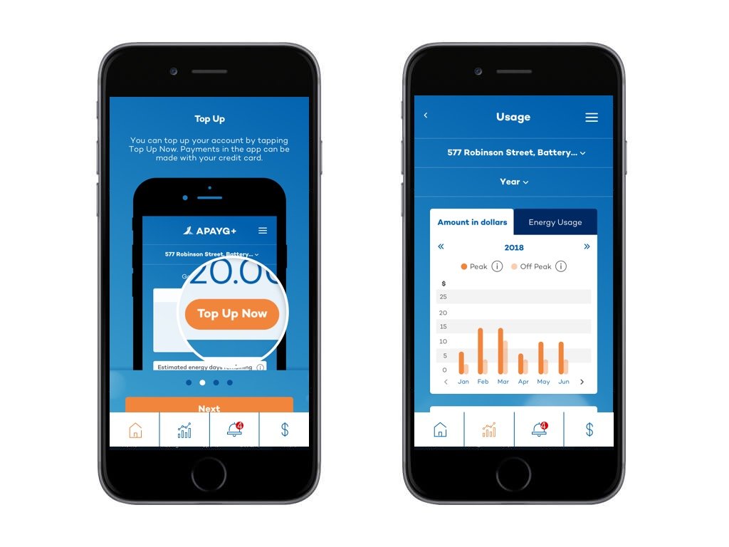
Ability to top up (pre-pay) into account for power usage to transition from physical card to digital system 24/7
Peak and off peak usage able to be filtered by dollar amount and actual kW usage empowering users to make more informed energy choices and better manage their energy use.
Transaction history and notifications within easy reach
Login, help and account settings
Simple language and minimal microcopy suitable for target audience which has had high functional illiteracy.
Colour coding as per Aurora energy brand
Outcomes
Over 100K customers
of Aurora+ in Oct 2024
1 in 3 homes
in Tasmania as users (as at Oct 2024)
3+ additional segments
Small/Medium business, Solar, Post-paid power
Conclusion and evolution
Aurora Energy released the product in early 2019 through several rounds of testing and smaller trials. Similar approach was followed as in the initial round.
The app was endorsed by the senior leaders in the community. Today, 70% of Tasmanian homes are on smart meters of ~240K customers.
As the foundation was built, Aurora energy and their partners were able to build on top of the MVP to include additional features and services. The following year, Aurora energy explored different audiences like business and solar energy customers for the product to iterate it even more.
Aurora energy were able to understand the agile methodology and work in a fast-paced environment delivering requirements and towards a goal and election promise delivering an app in 9 months. They have been consistently taking on user feedback through various forums and are evolving the product suite for Aurora+
Awards
2019 - Winner - AIIA Industry Award
2019 - Winner - iAward in Tasmanian State Public sector category
2019 - AFR Boss Most innovative companies list - 8th - for most innovative agriculture, mining and utility companies
2024 Finalist - AFR Energy Awards - Aurora+ (evolved apps)