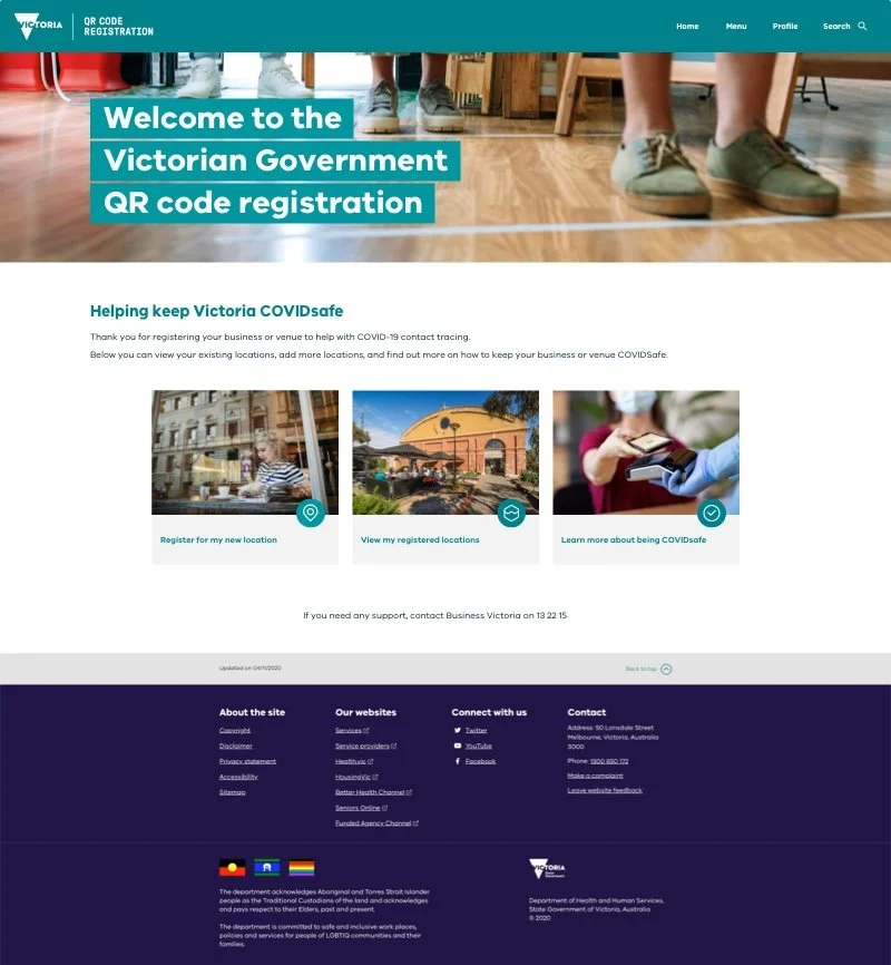
Vic Gov QR code Service
Client
Department of Premier and Cabinet
Timeline
~12-14 weeks including pilot at 4-6 weeks mark
Role
UX / Product Design (50%), User Research & Service design (30%), Facilitation and collaboration (30%)
Regular collaborators
Product Manager, Salesforce delivery team, Design Systems UI designer.
Other Stakeholders
Department of Health, Department of Jobs, Precincts and Regions and Service Victoria app team
Delivered
UX of a free service that can be accessed by any venue owner as a minimum viable product out in market in 12 weeks.
A set of findings using co-design and pilot research, to inform the roadmap.
Impact: 178K venues, 8 Million daily checkins statewide at peak
Background
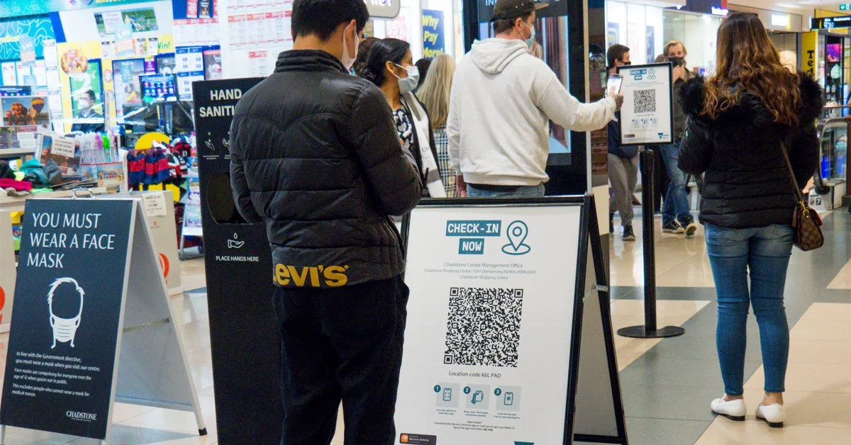
In 2020, Melbourne and Victoria entered an extended lockdown lasting over 12 weeks, forcing businesses and venues to close. When venues reopened, they needed compliant digital visitor registration for contact tracing, but existing solutions were problematic:
Non-compliance: Some venues were still using notebooks and weren't fully compliant
Poor usability: Existing apps required downloads and were not fully usable
Privacy breaches: Third-party QR services were using visitor email addresses for spam and breaching privacy rights
Fragmented data: Government couldn't easily access visitor records for contact tracing, and data wasn't deleted after 28 days as per privacy rules
Focussing question
“How might we enable Victorian venues to help COVID-19 contact tracing by allowing their visitors to digitally register their visit during social gatherings?”
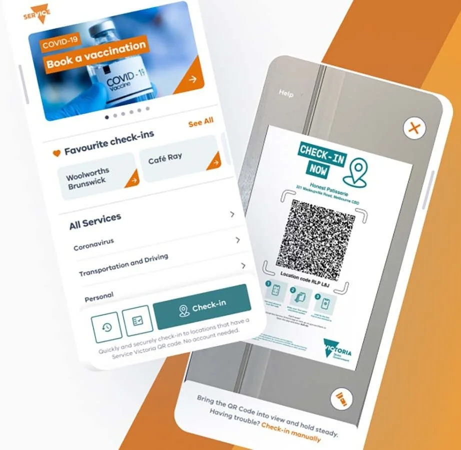
The solution
A quick free digital service that lets venues create their own specific QR code to let citizens check-in.
Approach
Identifying users, Understanding user needs, Know other jurisdictions.
Understanding business needs for every government department and their stakeholders
Creating a prototype
Validating feasibility of UX with Salesforce platform.
Market research for QR code design and practical use in the wild.
Running pilot with end users
Using combination of qualitative data and quantitative analytics to understand user pain points to be solved
Refine and deliver Improving on the pain points, accessibility, and inclusion for whole community.
Executing for high customer adoption at launch
Understanding the Multi-User Challenge
The “needs” from the workshop were translated to design the user experience
While our squad focused on venue owners, I took an integrated service design approach, considering needs across three user groups:
Venue owners (businesses needing compliant registration)
Citizens (visitors to venues)
Contact tracers (Health Department staff)
A quick process was used as seen alongside to map there requirements against each user group and categorised based on who was required to develop the feature/service.
Key Design decisions based on identified requirements
1. Streamlined Registration Process
Requirements: Input equals output on poster - information gathered from venue owners about their venue displays as unique address and business name on the poster
Design decision: Quick poster generation within a few minutes (less than 10 minutes for most single-location businesses), acknowledging that poster printing was the venue owner's
2. Multiple Location Support
Requirements: Some businesses owned multiple venues with different primary contacts (e.g., franchises)
Design decision: Ability to add multiple locations within the same UX flow as an option, as opposed to filling the same form multiple times
3. Secure but Accessible System
Requirements: Secure registration portal that's easily accessible
Design decision: Email and password system allowing business owners to add other locations or make edits
4. Workflow Integration
Requirements: Each venue type had distinct customer journeys but shared similarities. e.g. Large restaurant with indoor+outdoor seating welcoming users to their seats, vs. small retail shop with single staff at counter.
Design decision: Instructions showing where QR codes would fit into existing venue workflows
Key design constraints
Technology platform: Salesforce backend with QR code registration form frontend
Speed to market: Critical timeline requirements for the State Government
Privacy-first: Check-in data hidden from venue owners, deleted after 28 days
Proven concept: Similar services had worked well in other jurisdictions, interstate and globally
UX and UI approach
Created user flows and forms in Miro for Salesforce forms and portal workflows
Validated feasibility with developers through daily check-ins using Lightning out-of-the-box system
Converted Miro UX forms to Lightning web components in Sketch; Combined with Ripple Design System
Used custom components for Salesforce where required, contributing to Ripple design system
Designing content for emails, websites.
Working with Accessibility standards and 3rd party testing for accessibility.
UX flow
Tools
•Salesforce lightning design system components, Sketch
•Miro (online workshops, design, requirements gathering, presentations, UX reviews, etc),
Rationale for approach
By creating the desired experience and collaborating with with Salesforce architects and front-end developers, we used an iterative approach using a combination of out-of-the-box Salesforce components and custom-built HTML pages where necessary.
A full agile approach was applied which meant design was being implemented directly on the platform in batches.
I worked with the DPC UI designer to come up with these style guide and tokens for the design system for this product based on Ripple and Lightning


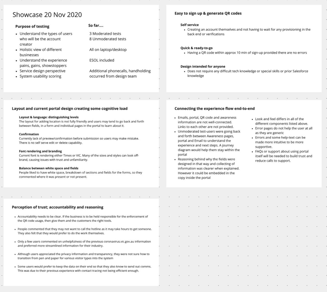
Pilot planning and execution
A pilot period was conducted to learn about the product before its full state-wide release for QR code design and practical use
Planned pilot with 100 venues using mixed-methods research approach
Coordinated site visits, unmoderated testing, and moderated testing
Developed research plan, determined sample sizes, recruited users
100 venues
Tools
Communication and Research Ops
MS teams, Phone, Slack, Excel
Site visits
Clipboard, Camera, Eyes & ears
Unmoderated Testing & SUS survey
UserZoom, Surveymonkey
Capture, synthesise and present findings
Miro, Presentation mode
Key insights and actions
Note: Limited insights are mentioned here
-
What we learned: Venue owners found some of the copy ambiguous, making them hesitant to proceed despite wanting to support government efforts
Design response: All copy was reviewed page by page and made clearer to avoid confusion and increase conversion about privacy and venue owner duty boundaries
-
What we learned: Due to enforcement requirements, venue owners assumed they would still have to maintain records and inform their visitors
Design response: Created more information via DJPR to clarify where venue owner responsibility ended
-
What we learned: After observing visitors in venues, our team found there was an assumption that venue owners and visitors would figure out the technology, but this tech was new to Australia despite being used in Asia
Design response: Created user guides and in-context help in the registration and check-in process, specified that no app download was required, and added ability to add dependents
Cross Department Collaboration
Facilitation was crucial to align three government departments simultaneously. Key collaborative workshops I facilitated included:
-
User research synthesis
Collaborative data sharing sessions where researchers brought observations, photos, and notes from site visits

-
UX pains & Gains workshops
Used results from moderated and unmoderated testing to identify pain points, gains, and showstopper issues across the venue journey

-
Roadmap against vision
Co-facilitated workshops with Product Manager using breakout teams to align stakeholders and leads back to product vision

-
Retrospectives
Fortnightly sprint reviews with core project team members to improve process and product

With the insights and long term goals defined, we were able to focus on the final state of the user experience, post pilot.
With knowledge from user research, changes were proposed to the pilot experience and scoped out with our technology implementation teams
Then they were prioritised and put into the Backlog (immediate action) or Roadmap (future sprints)
In addition, accessibility testing results from an independent vendor were also reviewed and put on the backlog as mandatory fixes.
The solution was handed over to Department of Health to operate and they did some additional adjustments over the next year as the pandemic situation evolved.

UX improvements post-pilot and post launch
Screen recording showing high fidelity wireframes using a combination of Ripple and Salesforce lightning system
Ripple is the Vic state government design system to create consistent standards and familiarity for citizens.
Final design that was launched after 12 weeks
Features and benefits:
End-to-end process under 5 minutes for most venue registrations
Multi-location support for franchises and branches with different contact persons
Instant QR code generation with email delivery of poster links for all registered locations
Secure login portal for editing details and regenerating QR codes
Flexible printing options in preferred sizes for different purposes
Plain English user guides and privacy information
WCAG compliance through independent accessibility testing
Outcomes
178K venues
Victorian businesses were users of the service
400K unique posters
on display around shops and communities.
8.1 million daily check-ins
QR code check-ins daily at its peak
Conclusion and evolution
Service Evolution
The service was mandated in May/June 2021, replacing third-party app providers. It remained effective until vaccine rollout reached over 90% of the population.
Extended Applications:
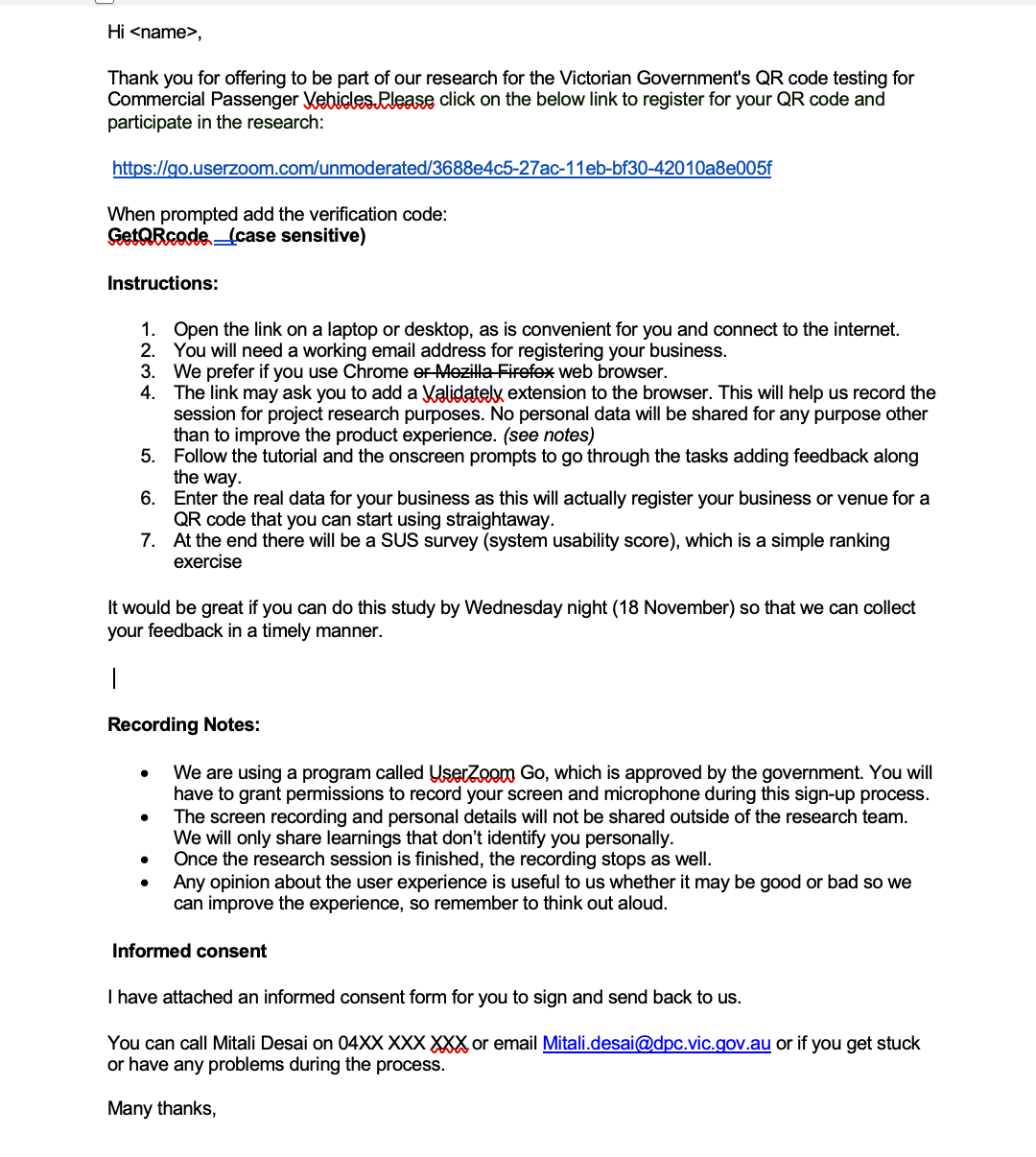
Rolled out to commercial passenger vehicles (taxis, rideshares)
Learnings informed design of kiosk service for users without smartphone access
Methodology applied to subsequent government digital services
Quality Outcomes
Privacy protection: Built system that created trust in contact tracing while satisfying privacy obligations
Accessibility: Content and UI independently tested for accessibility
Inclusion: Designed kiosk service to include populations without smartphone access
-
The service was mandated in May/June 2021 and replaced other 3rd party app providers
Until the vaccine was rolled out successfully to over 90% of population this service was effective.
-
If this project was not mission-critical, and fast-paced, I would do market-sizing, market research and product - market fit analysis upfront to get richer data and target the research as well as the product to the right audience and then create a roadmap from it.
The temporary scaling up of mini-research teams worked well by providing team members with worksheets and helped them to develop empathy with the users of the product too.
-
Key Takeaway
This project demonstrated how rapid, user-centred design can deliver critical public services under extreme time pressure. The collaborative methodology developed for cross-departmental alignment and pilot-driven iteration became valuable for subsequent government digital services.